Edelman, a global communications firm, sought to create a dynamic and innovative office space that reflected its unique brand identity. The goal was to design an environment that offered scenic views at every turn and broke away from conventional office layouts. This case study explores the transformation of Edelman’s office into a space that not only met functional requirements but also fostered creativity, collaboration, and employee well-being.
Design Vision
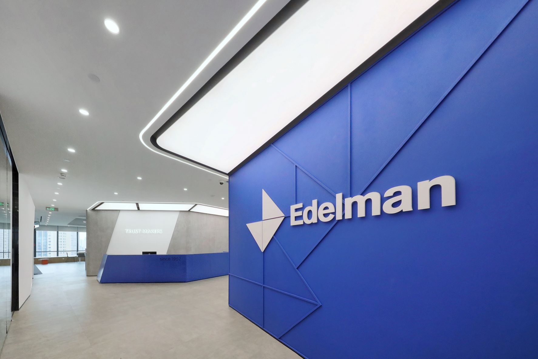
Edelman’s office design aimed to encapsulate the essence of the brand through innovative spatial arrangements, materials, and color schemes. The vision was to create a small and exquisite reception area, functional and aesthetically pleasing meeting rooms, and a large, multifunctional leisure area. The design also needed to ensure seamless transitions between workspaces and leisure zones, providing mental buffers and unique experiences throughout the office.
Key Design Elements
RECEPTION AREA
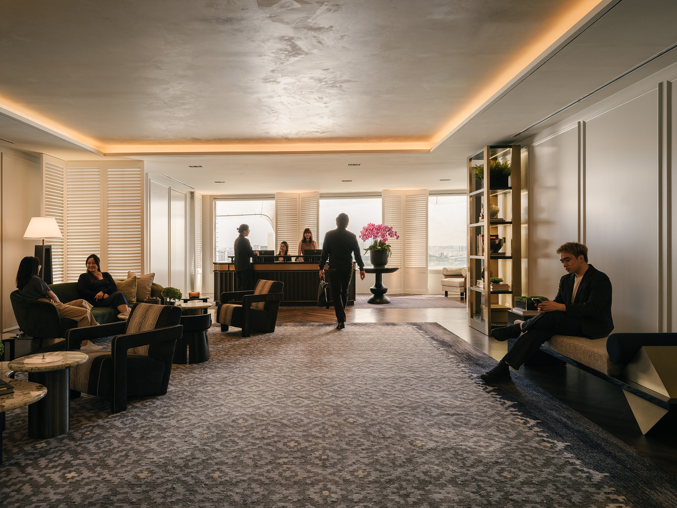
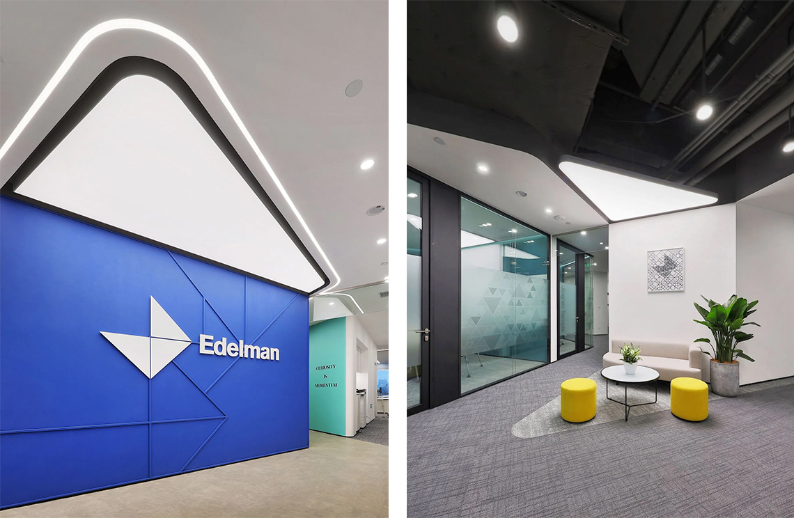
Small and Exquisite: The reception area was designed to be compact yet welcoming, conveying an intimate feel. Innovative forms and textured materials were used, with harmonious color coordination to highlight Edelman’s distinctive features.
Brand Integration: The reception desk and surrounding design elements prominently showcased Edelman’s brand identity, with subtle yet impactful use of color and form.
MEETING ROOMS
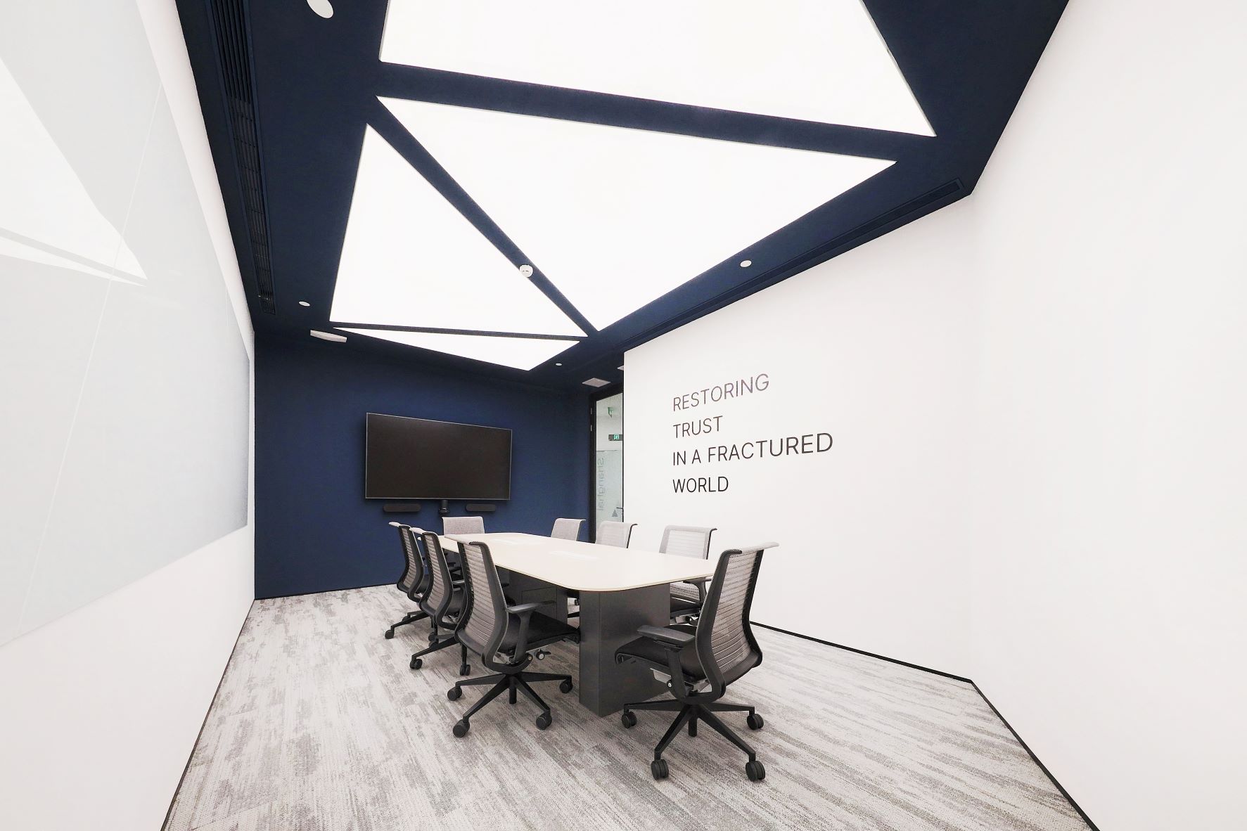
Small and medium-sized meeting rooms were designed to maximise space and functionality. Each room featured unique design elements to create an engaging and efficient meeting environment.
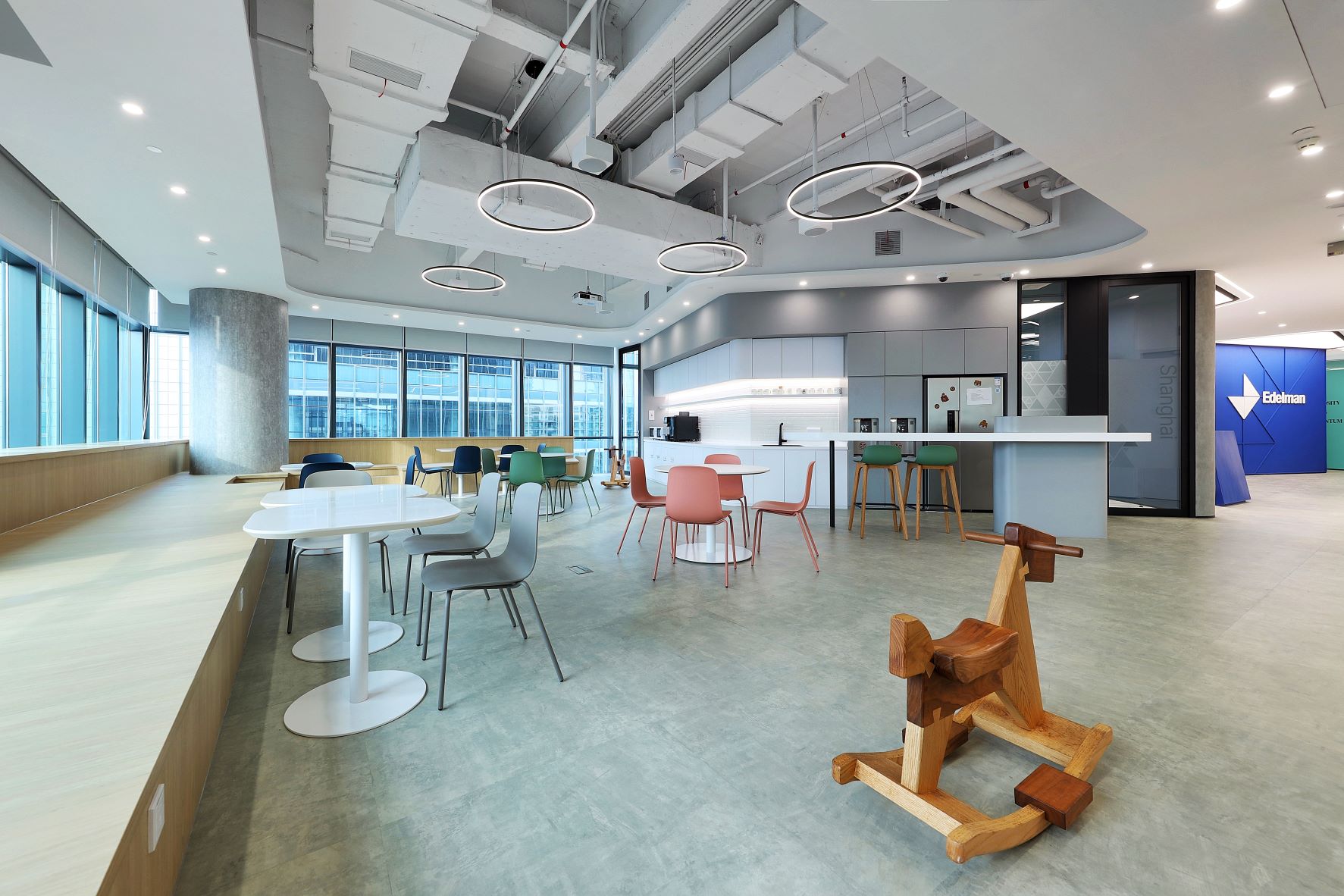
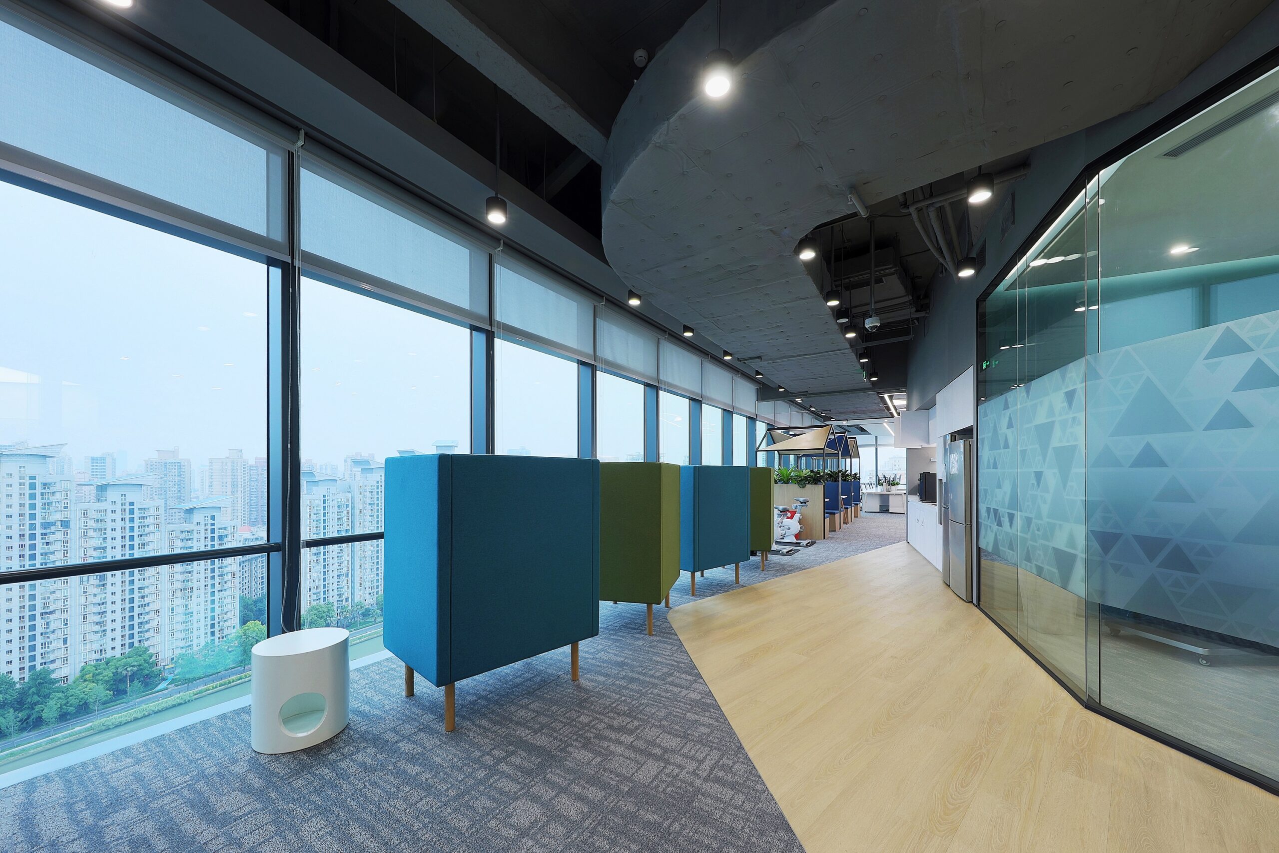
Flexible layouts allowed for discussions and meetings to occur in various settings, from formal meeting rooms to casual leisure areas by the windows.
LEISURE AND SOCIAL AREAS
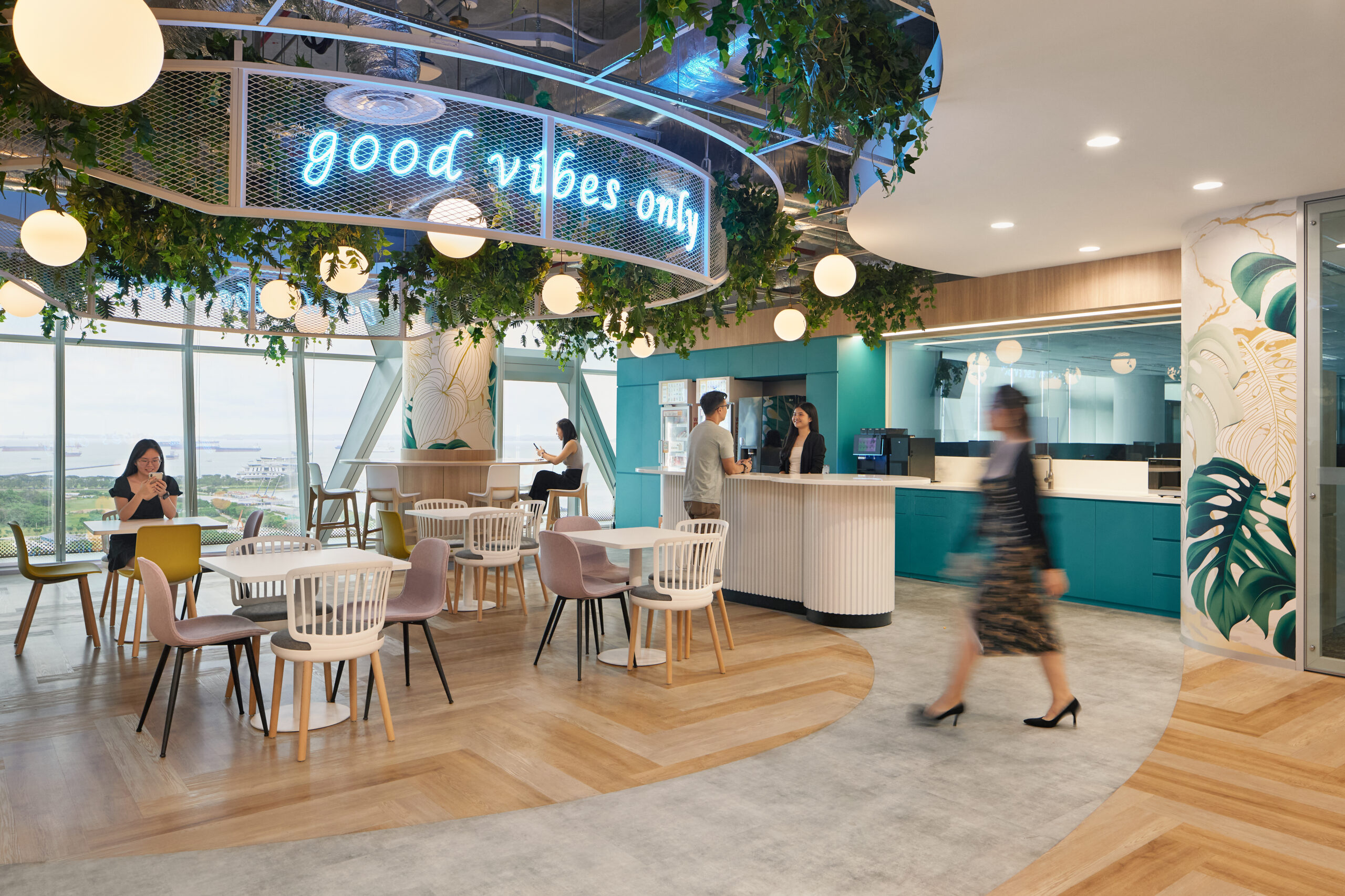
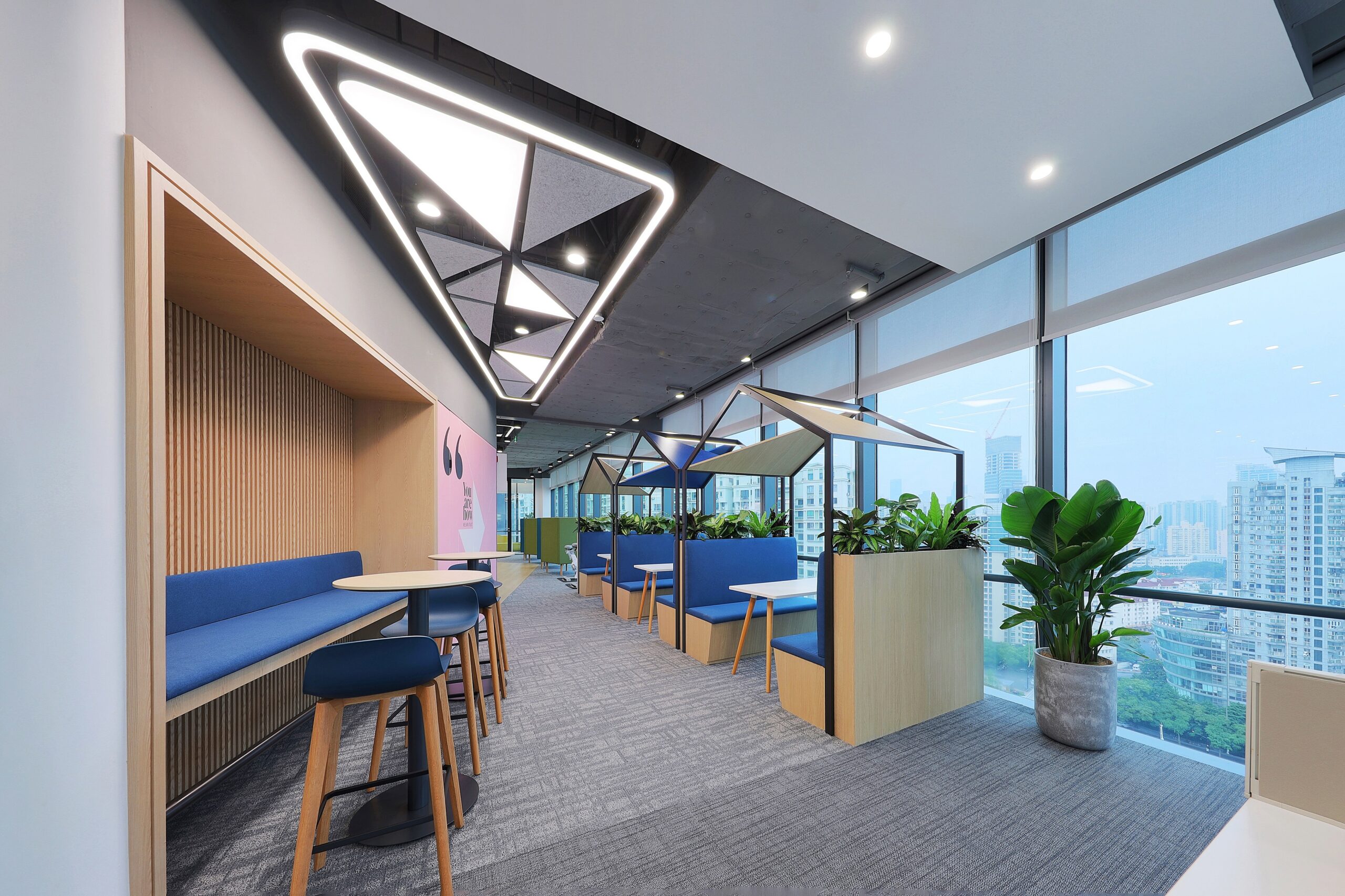
The leisure area was transformed into a multifunctional social hub, combining dining, relaxation, collaboration, and training. This space was designed to meet the diverse needs of employees and facilitate quick transitions between work modes.
Creative leisure zones and scattered seating in transitional areas provided mental buffers and unique experiences, reinforcing the concept of “a scenic view at every step.”
WORKSTATION AREAS
The design minimised physical barriers between management and teams, promoting open communication and collaboration.
Different workstation configurations facilitated quick and efficient daily discussions among teams, enhancing productivity.
Unique Brand Integration
The design prominently featured Edelman’s corporate logo, which consists of overlapping triangles representing Edelman and its clients. DB&B initiated a creative transformation of the logo, incorporating it into various design elements:
RECEPTION DESK & SPACES
The logo’s form and color scheme were echoed throughout the office, creating a cohesive and harmonious design.
LEISURE SEATING AREAS
Blue triangular roofs on three small houses near the windows created a visual representation of the brand logo, adding an element of intrigue.
ACOUSTIC PANELS
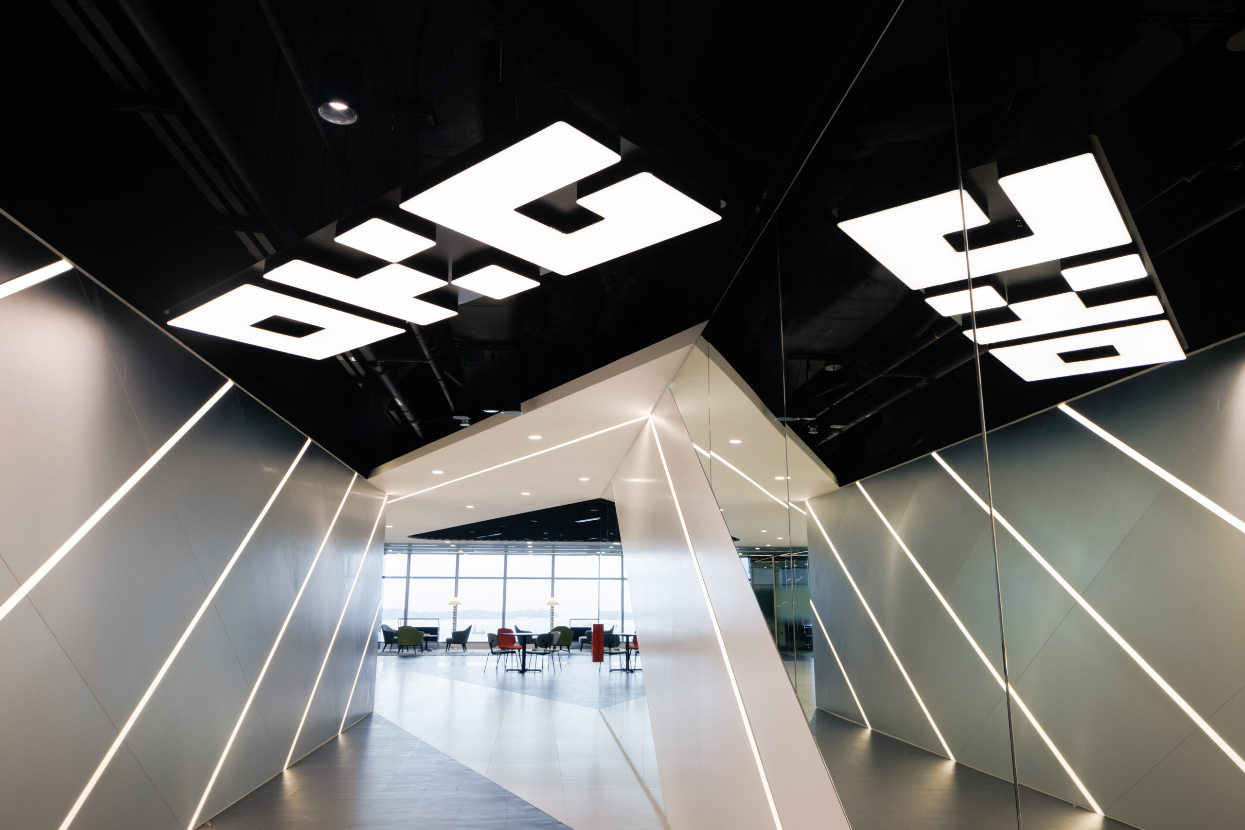
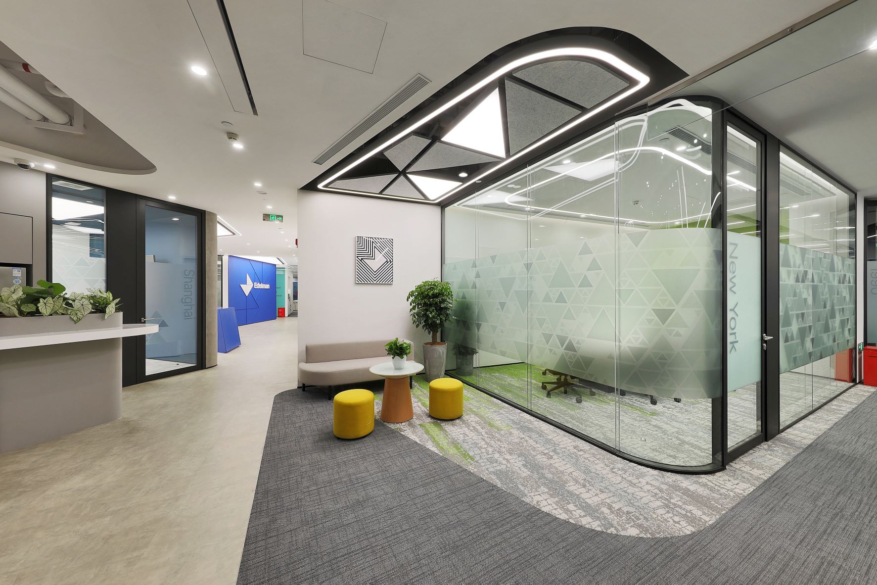
Triangular acoustic panels with lighting films were installed on ceilings, fulfilling both functional and aesthetic purposes.
Coherent Layout and Design
The overall layout was based on the brand logo’s design, ensuring coherence in patterns, colors, and arrangements. The office avoided traditional, monotonous layouts in favor of flexible, dynamic spaces that supported varied work modes:
FLEXIBLE MEETING SPACES
Meetings could occur in diverse settings, from leisure areas to tea stations, eliminating unnecessary navigation through transitional spaces.
PHONE BOOTHS
Finished phone booths in the workstation areas met employees’ communication needs.
Design Approach and Color Palette
DB&B chose a Muted Color Palette to create a soft and comfortable atmosphere, distinguishing different spaces without using bold, flashy colors. The use of low-saturation latex paint added sophistication and highlighted intricate details.
The acoustic panels’ Unique shapes and engravings depicted Shanghai’s landmarks. Nature-inspired carpets patterns from the SHOW Classic Collection added a touch of nature to the space.
Balancing Innovation and Functionality
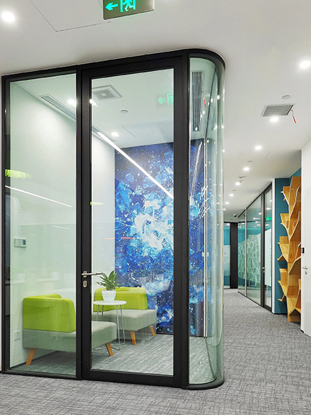
While the design embraced non-traditional layouts, it was crucial to maintain practical functionality and a moderately formal appearance. DB&B refined decorative elements in large and medium-sized conference and training areas to avoid a sense of dispersion:
CONTROLLED AESTHETICS
Transition areas like hallways were meticulously designed to maximise comfort and incorporate leisure buffer zones.
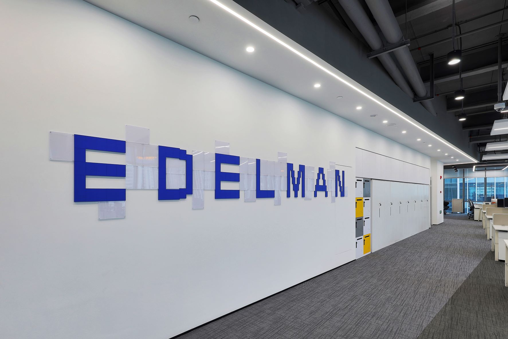
CORPORATE SHOWCASE WALL
In the open office area, a showcase wall integrated brand elements with replaceable picture frames.
NATURAL-THEMED BOOKSHELF
A distinctive bookshelf in the leisure area added a touch of nature and sophistication.
Conclusion
DB&B successfully transformed Edelman’s office into a dynamic and innovative space that reflected the brand’s unique identity. The design provided scenic views, fostered creativity and collaboration, and met functional requirements without compromising on aesthetic appeal. The result was a captivating office environment that energized employees and facilitated efficient work modes, showcasing the perfect collaboration between Edelman and DB&B.
